Simple Interoperability Wins with IIIF
Published: 2016-09-20 14:00 -0400
At the NCSU Libraries we recently migrated from Djatoka as our image server and from a bespoke user interface for paginated reading and search inside to a IIIF-compatible image server and viewers. While we gained a lot from the switch, we pretty quickly saw the interoperability wins gained from adopting the IIIF standards.
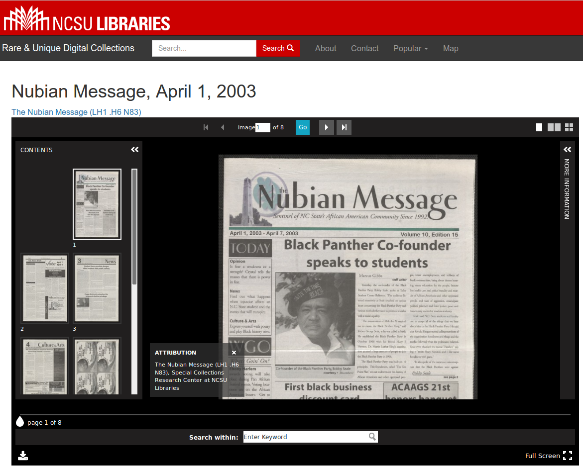
For a long while we had been using a book reader that I developed that wasn’t great, but that was better than the paginated readers that were out there at the time in a number of ways. Since then it hasn’t aged well compared to the most recent viewers. When we were moving towards IIIF it gave us the opportunity to evaluate our options again. I really like a lot of the features that UniversalViewer (UV) provides including a thumbnail navigation pane and support for the IIIF Content Search API with hit highlighting.
While UV is somewhat responsive, it does not completely respond well to very narrow windows or small mobile device screens. We had spent a lot of effort with our past reader to provide a decent experience on mobile, so it was disappointing to take away functionality that we had provided to users for years.
While UV has plans to make progress soon on updating the interface to work better on mobile, we didn’t want to wait to push out the improved desktop experience to users. So like much of the progress on the web we relied on a fallback. Desktop and other large display users would get the more powerful UV interface, while narrow window and mobile users would get–something else. At first we just included the first image for a resource as a static image along with a PDF when available. So we didn’t provide any pan/zoom interface or way to see any other images for the resource. That at least let us get on to other things.
And here is where the story gets interesting and IIIF really comes into its own. It is worth understanding just a bit of how IIIF works to understand the next part. All we needed to create in order to implement UV was a IIIF Presentation manifest, which is a JSON-LD document with information on how to display (or present) the resource to a user including a list of all the images to display in order. You can see an example of a manifest here. While many probably still associate IIIF only with the Image API and the image servers that have developed around that specification, the real wow factor is with the Presentation API. The same manifest can be used in multiple viewers that know how to parse these manifests. And further the other viewer could be on our own site or within a completely different interface developed and hosted by someone else.
We looked at other viewers that have implemented the Presentation API and chose to use Leaflet-IIIF. Leaflet is a simple, mobile-friendly tiled map viewer, and Jack Reed developed a plugin to add support for IIIF Presentation manifests to Leaflet. This was almost all we needed, except the default way to change images in Leaflet-IIIF is via a layers control that works well enough for a few choices of map layers, but does not scale to a 20+ page book. I needed another way to move through the pages. It had been a long while since I had done anything with Leaflet, but once I had found Leaflet.Easybutton it was simple to create two buttons for next and previous pages, and the EasyButton plugin also helped with changing the states of the buttons when reaching the first or last page. Here’s what our current solution looks like in action:
The last bit was to show/hide the two different viewers based on media queries. While we could have tried to use JavaScript to choose the correct viewer and then switch between the two, initializing these types of viewers at different times and different sizes can sometimes be tricky. Based on my previous experience even hiding and showing these types of viewers could lead to many hours of frustration, so I was happy to see that both UV and Leaflet had no deal breaker issues with being repeatedly shown and hidden again as a browser window gets narrower and wider.
We hope this is a temporary solution, but I think it clearly shows how shared standards can be a big interoperability win. With the short deadline we had for pushing out this new functionality, having multiple viewers available meant that we could forge ahead while still providing a good experience for most users. Having multiple viewers available that cover different niches saved us countless hours of work.
You can see more of how we’ve implemented these viewers here: http://d.lib.ncsu.edu/collections
Thanks to Simeon Warner for pointing out how this was a IIIF interoperability win. And here he created a short screencast of this in action as well:
